
The "Infographic" tool in the Studio panel uses your uploaded sources (PDFs, URLs, YouTube transcripts) to generate structured visuals. To customize them, you click the pencil icon before hitting generate.
- The "Neumorphic Dashboard" (Modern/Tactile)
- The "Strategic Framework" (Conceptual/Logical)
- The "Journey" (Sequential/Timeline)
- The "Analog Whiteboard" (Sketch/Hand-drawn)
- The "Sumi-e Tech Scroll" (Artistic/Minimalist)
- The "Competitive Landscape" (Side-by-Side/Versus)
- The "Data Comparison" (Clean/Professional)
- The "Executive Snapshot" (Metric-Heavy)
- Other Interesting Styles / Layout
Neumorphism uses soft shadows and highlights to make flat elements look like they are "pushed out" from the background. It feels very high-tech, clean, and futuristic—great for visualizing software features or digital trends.
Style: Neumorphism.
Use soft 'extruded' cards and subtle drop shadows on a light grey background.
Layout: A central hero circle with 4 symmetrical 'bubbles'
that feel like physical buttons.
"Create a clean, monochromatic look with glowing blue accents
for 'active' data points.
Style: Glassmorphism. Use frosted-glass overlays for text blocks
with a colorful, blurry background visible underneath.
Design the infographic to look like a high-end
aerospace control interface.
Used by consultants and strategists, this layout visualizes abstract ideas like a "Maturity Model," a "Flywheel," or a "SWOT Analysis." It turns dense strategy documents into high-level maps.
Style: High-end management consulting slide.
Create a 'Pillars of Success' diagram using the 3 core themes in my notes.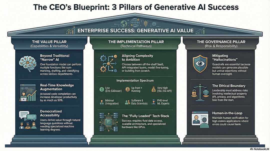
Layout: A 2x2 Matrix (Quadrant) style. Map the concepts in the source
based on 'Ease of Implementation' vs 'Business Value'.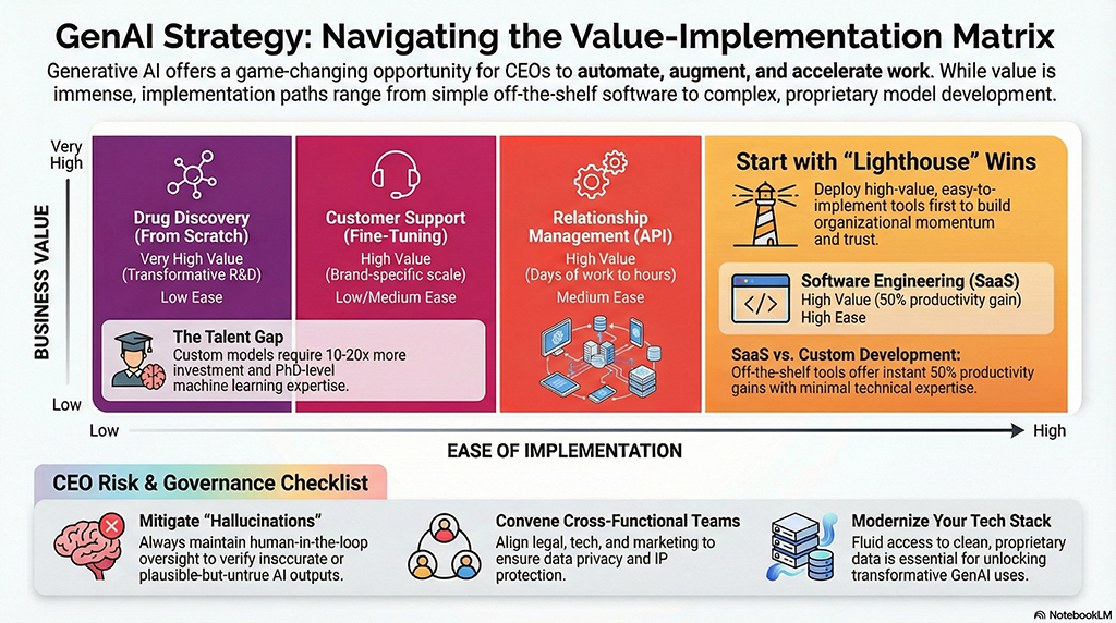
Visualize the [Strategy] as a circular flywheel,
showing how each step feeds back into the next for continuous growth.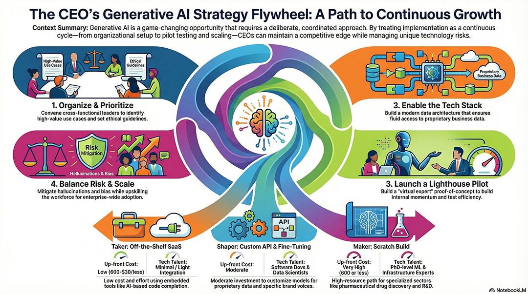
Style: Swiss Design. Use a strict grid, sans-serif fonts, and geometric shapes
to show the hierarchy of [Organizational Goals].
Design a 'North Star' diagram
with one central objective and 4 radiating supporting strategies.Best for histories, career milestones, or step-by-step processes. It uses a clear flow—often a "Z" or "S" shape—to guide the eye from the start to the finish.
Style: Oregon Trail pixel art. Create a visual journey of the
[Historical Timeline] found in my sources.
Layout: A winding road metaphor starting from the top-left to
the bottom-right, marking 5 key milestones.
Create a 90s/Y2K retro style timeline with neon colors and
chunky typography.
Design a 'Knowledge Map' where the user travels through
different islands representing chapters of the [Document].
Style: Vintage transit map with clean lines and colored nodes
representing different phases of the project.![]()
This style mimics a human expert drawing on a board. It feels authentic, educational, and less "corporate." It’s great for summarizing lectures or brainstorms.
Style: Classic whiteboard sketch with hand-drawn icons and
felt-tip marker textures.
Style: Chalkboard aesthetic with white 'chalk' outlines on a
dark green textured background.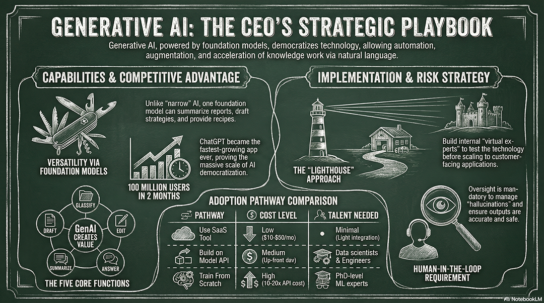
Create a 'Sketchnote' style layout with messy arrows, circled
keywords, and doodles.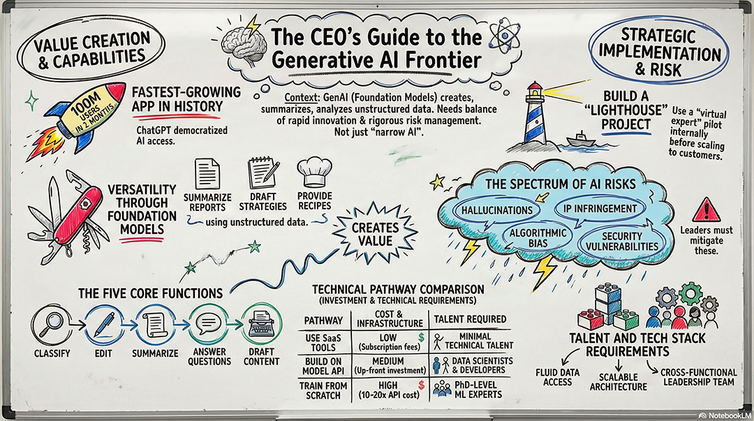
Style: Watercolor and ink. Use soft washes of color to
highlight the primary themes of the [Topic].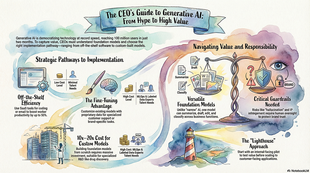
Design the infographic to look like a field researcher's
notebook with taped-in photos and handwritten notes.This style blends traditional East Asian ink-wash aesthetics with modern technical data. It uses varying ink densities, "parchment" textures, and elegant vertical layouts. It’s perfect for storytelling or high-level philosophical/strategic concepts.
Style: Sumi-e ink wash on aged papyrus. Use black ink for data
nodes and red 'stamp' icons for highlights.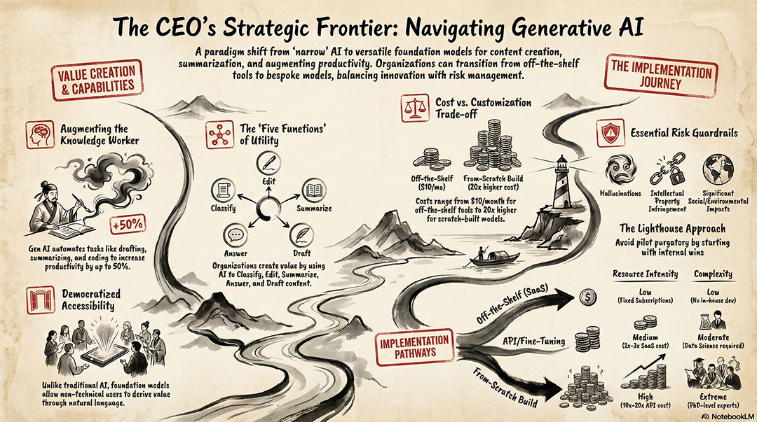
Layout: A vertical scroll design where the information flows
from top to bottom like a traditional calligraphy piece.
Create a high-fidelity infographic with soft, watery edges and
hand-painted textures for the [Topic] framework.
Use a 'Zen' aesthetic: minimal lines, lots of negative space,
and a single branch-like connector for all points.
Style: Neo-traditional ink painting. Pair technical labels
with elegant, fluid silhouettes of the objects described.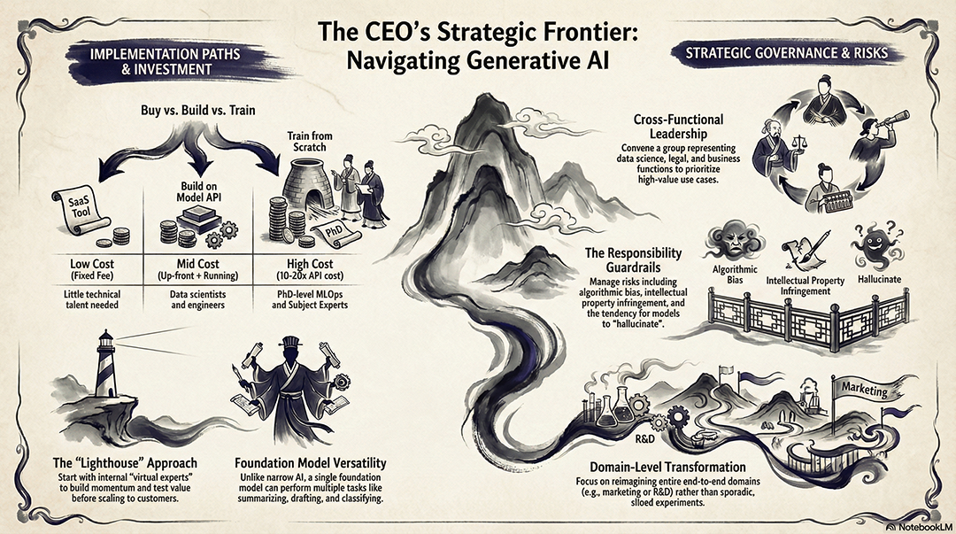
This is the go-to for market research, product positioning, or vendor selection. It provides a direct comparison of features, pricing, or strengths to help stakeholders make a choice.
Layout: A vertical 'Versus' split comparing the current
solution against the proposed [New Tech/Strategy] from the
source.
Style: Professional comparison table with 'Checkmark' and 'X'
icons to visualize feature parity.
Create a 'Battlecard' infographic highlighting our unique
value proposition compared to the 3 competitors mentioned.Style: Clean tech-explainer. Use a 'Winner vs. Loser' layout
for the [Scenario] with neutral, objective colors
(Gold/Silver).Design a 'Pros and Cons' list using a balanced, symmetrical
layout with soft green and red accents.This layout is designed for side-by-side analysis, such as comparing two products, strategies, or datasets (e.g., CPU vs. GPU vs. TPU).
Style: Professional tech explainer. Use a clean duotone
color scheme (Navy and Silver).
Create a side-by-side comparison chart highlighting the
strengths and weaknesses of [Subject A] vs [Subject B].
Layout: Use modular cards for each category, ensuring 30%
white space for a polished, airy feel.
Generate a 'Versus' layout with a split-screen effect and
high-contrast icons for each side.Style: Modern SaaS dashboard look with clean sans-serif
fonts and flat vector icons.This layout is designed for boardroom updates. It de-emphasizes prose and focuses on large, bold numbers (KPIs) supported by minimal icons. It’s perfect for quarterly reviews or project status updates..
Style: Clean executive summary. Use large, bold typography for
the 3 most significant statistics found in the source.
Layout: A 'Top-Line' grid focusing on 'Impact vs. Investment'
with a professional navy blue and slate grey palette.
Create a minimalist 'Scorecard' visual that highlights targets
reached versus remaining goals.Style: Modern financial report. Use high-contrast headings and
simple progress bar icons for each project phase.Design a 'Data Snapshot' with 5 key numbers, each accompanied
by a 3-word caption and a simple vector icon.Infographic design. Visual style: Corporate Style, featuring
Corporate Memphis style. Flat illustrations with exaggerated
proportions. Soft pastel color palette. No outlines.
Infographic design. Visual style: Pop Mart Style, featuring 3D
character design, Pop Mart blind box toy style. Chibi proportions.
Smooth matte plastic texture. Soft studio lighting.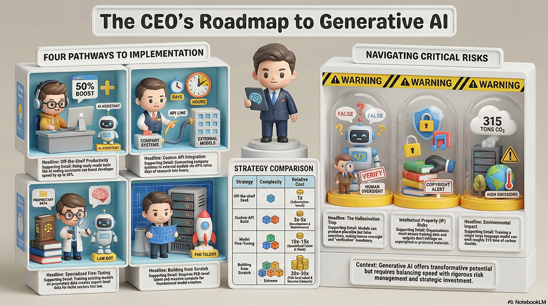
Infographic design. Layout: Snake Flow. Visual style: Chalkboard
Style, featuring Classic classroom chalkboard style. Dusty dark
green board with hand-lettered chalk effects.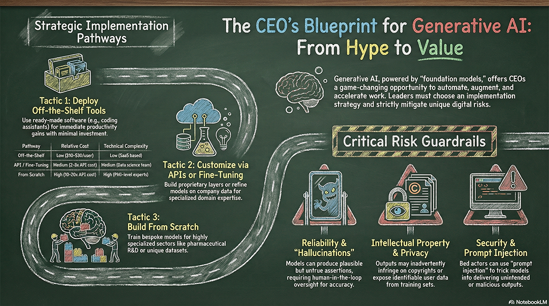
Infographic design. Visual style: Whiteboard Style, featuring
Whiteboard brainstorming style. Thick and colorful dry-erase
marker strokes. Glossy white background with reflections.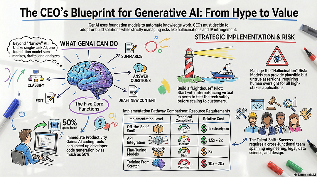
Add comment